How's everybody doing? With the New Year upon us, I think we are feeling a mix of emotions. Some may be diving into their resolutions of eating well and exercising, while others are manically cleaning and organizing their homes. Whatever your focus is, the reality of life at home has allowed us to live at a more relaxed pace, and to recognize what our priorities are to survive this situation.
Turning to a lighter topic, have you watched the latest Dream Home Makeover series by Studio McGee?? I binged watched the second season on January 1st! Shea and Sid McGee have just skyrocketed into the design world over the last few years. They are the cutest young couple with two sweet ginger hair daughters that operate both a full service design studio and an online home store called McGee and Co.
To describe their style, I would say its a mix of traditional and warm modern, with a vintage edge. Let's take a look at some of the design tips from the series, that we can take and implement in our own homes.
Tip #1 Mixing Pattern and Woods

We say this often as Designers, but don't be afraid to introduce and mix different patterns in a room. This kitchen is in a heritage home and Shea wanted to preserve some of the vintage elements. The new classic checker board floor pairs well with the black and white floral wallpaper, as well as the stripe on the ottoman. Tonally they are all the same colour, so they relate without competing with each other. The vintage wood built in cabinet was restored from the original kitchen, and Shea introduced a light wood dining table and cane chairs to contrast the warmer wood tone. The darker walnut colour on the island balances the warm tone of the cabinet and carries that colour to the other side of the kitchen.
Tip #2. Create a photo gallery wall

A gallery wall of photos is a great way to personalize a space in your home. Now, most realtors will say that you shouldn't have personal photos in the "public" spaces of your home. But in this case, I think it's been done very discreetly. The photos are not too large, and they are framed with an oversized matte to give them a gallery feel. The photos are printed in black and white and are all the same size, to create symmetry. You'll also notice the mix of other images of nature within the family photos, creating a nice balance.
Tip #3. Texture in a monochromatic space

This gorgeous dining room from the Sunset house in Season 1 demonstrates how a mostly neutral space can still have personality. Shea incorporated so many different textural elements in this space. The cane back chairs, the wood bowl, the concrete lamp, the subtle wallpaper, and the textured art, all create the layered depth and eye catching interest that makes a room look polished and complete.
Tip #4. Shelf Styling and Storage
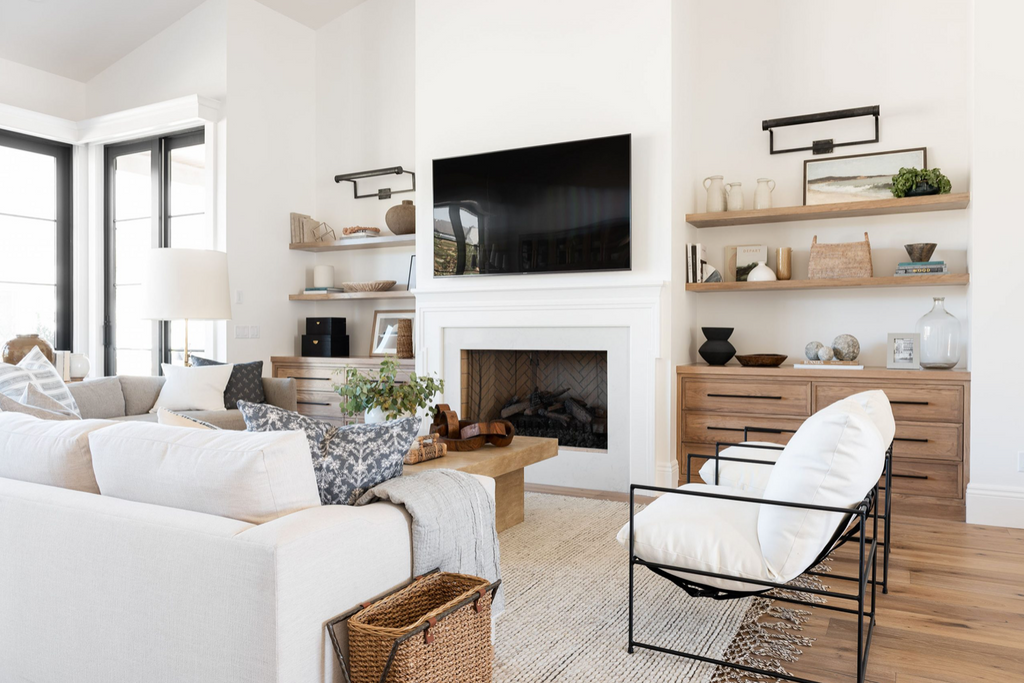
Shea and her team are experts at styling shelves. The key is to incorporate items that have meaning to you or pieces you just love. Styling can include a mixture of vases, bowls, books, baskets and art to create a collected look. Groupings of odd numbers or single items always look best. Remember to layer items in different heights on the shelves, making use of both horizontal and vertical space. Notice how Shea injects some black pieces to provide contrast, as well as a plant to soften the space. Baskets are always included in most of Shea's styling both for functional storage and to add texture.
There are so many more design tips we can take from Studio McGee, but you'll have to watch it on Netflix to learn more. I promise you won't be disappointed! Hope you enjoy it!